If you’ve been sharing your photos online at all in the last couple of years, there’s a good chance that you might have heard of 500px. This Toronto-based photo sharing website has been working to revolutionize that photographers view and use online photo sharing websites.
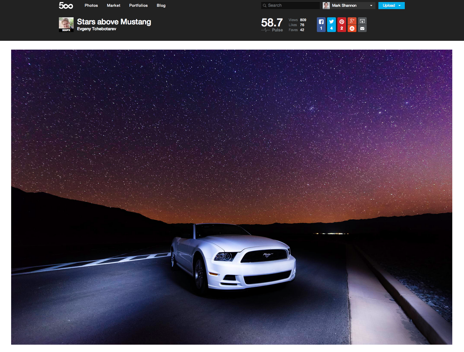
500px know, as do many professional websites, that in order to stay revolutionary they have to implement new features or even a website redesign. Today, they’ve released yet another update to their already well-designed website with a brand new layout for their photo pages.
With a new position at the top of the page for social sharing buttons, the Pulse meter, and the Like/Fav buttons, at first glance the team at 500px has already done great things for displaying photographers’ work. More real estate to display photos as they were intended is always a great thing.
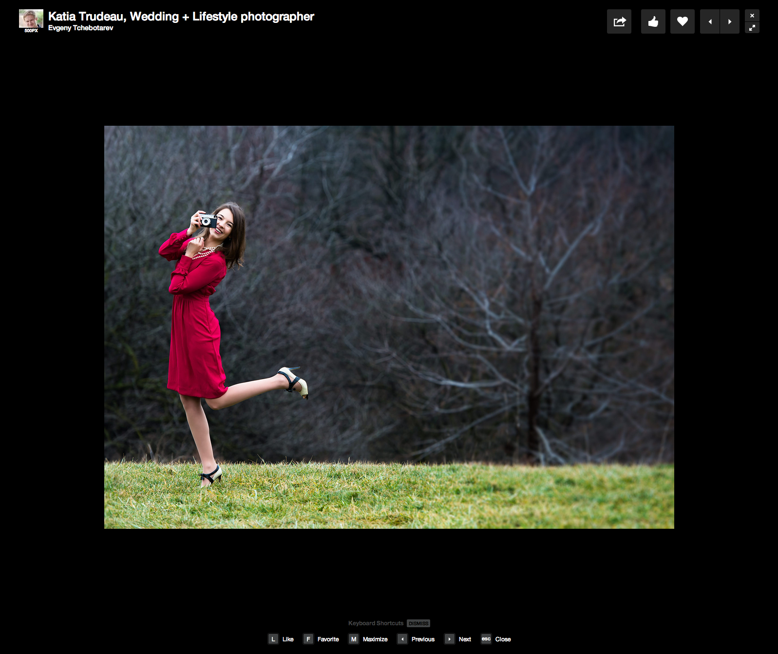
Beyond this, 500px has also introduced a series of keyboard shortcuts that allow users to navigate the site with ease. “H” turns on a sort of blackout mode, removing distracting white space, but keeping the user interface elements that 500px users are familiar with. “M” is used to maximize the page, which blacks out everything, and removes the UI elements, making for a comfortable and seamless photo viewing experience. With this, someone could quite literally sit back and browse through an endless supply of amazing photographs while still being able to Like/Fav photos, giving photographers the credit they deserve.
If you haven’t already, you should most definitely check out the newly redesigned pages, and if you haven’t already, sign up for an account and get started with your photography on the world’s best photo sharing site.


