On a regular basis, photographers becoming more involved in post-processing will quietly take me aside and ask me what the histogram is all about and what it’s really telling them. I really appreciate the question, because the histogram is one of those things that has suffered from an inordinate amount of misinformation. So let’s try to get on the same page together.
I’m going to start with the science, as I am prone to do. A histogram is a graphic representation of a finite data set. It’s not specific to photography or imaging, it’s simply a mechanism to represent numerical data. For our purposes, we are going to discuss the histogram in the context of photography and examine the two most common photographic implementations, the histograms for RGB distribution and Luminance distribution.
I just read that previous paragraph and I promise to try not to sound like your worst lecturer at University. When we look at a photograph, we are looking at a range of luminance values. We can see these values as pure brightness (solely luminance) or brightness as a combination of primary light colours (red, green and blue). Most histograms that we see in post-processing software are delivered in the lowest common denominator of an 8 bit representation. JPEG is the most common file format in general use and it is 8 bit so this makes sense.
Even if creating this type of graph means using a histogram maker, the data elements are “binned”. This means that they are collected into little “bins” of specific size and interval. Since 8 bits is 2 to the power of 8, it’s easy to construct a histogram using 256 unique bins with values from 0 to 255. Zero means zero, there is nothing there at all, hence perfect black. 255 means the bit is full, there’s no tonal variance and all the values, whether luminance or RGB are at 100% or perfect white. Thus a photographic histogram goes from perfect black on the left to perfect white on the right.
To make the histogram, analysis of the source data is done and counters are placed in the appropriate bin. We have a span of 256 bins to cover the range from 0% to 100% and so the math gets done to determine how many counters are stuck in each bin. Then a bar graph is made for each bin, and all the bins are put together side by side from Bin 0 to Bin 255. Mathematicians reading this may decide I am oversimplifying. Yes, but the point is, I believe, getting across.
So now we have a histogram starting at Bin 0 to Bin 255 and this represents the luminance distribution across an image. If it’s an RGB histogram, each bin holds three distinct sub-containers, one each for red, green and blue. That’s why when we look at an RGB histogram parts of it are grey (where the values in the sub-containers are equal – and they aren’t really grey, this is just a vendor decision for display) and some parts have primary colours (where the sub-container value is at a point where it is larger than its peers) and even where there is a secondary colour represented (cyan, yellow and magenta) because the sub-container counts for two primary colours are identical and they combine to create a secondary colour.
Once we have a histogram we can use it to evaluate the tonal distribution in an image. For maximum dynamic range we would like a non-zero counter in every bin of the histogram. Zone system students would see this as from Zone 0 to Zone 10. If that means nothing to you, don’t worry, The Zone System, is a much larger conversation.
We can then use our luminance and tone controls in our digital images to push and pull data across the histogram to potentially make a more powerful image. Photography is a visual art, and it’s perfectly ok to have an image that doesn’t have data in every bin. You’re the artist you decide.
Typically we have five fairly heavy tools to manipulate the image data and alter the histogram. Blacks, pertain to the leftmost area, usually about one-sixth of the histogram. Then comes Shadows, again usually about one-sixth of the histogram. In the middle is what some software calls midtones, and other software calls Exposure, but really it is just the middle two-thirds of the overall histogram. Then there is Highlights for one-sixth or so and finally Whites for the final one-sixth or so to the right edge.
Remember that data in either the far left or far right bins are 0% or 100%, there is no variance, we say that these are “on the wall” and there is no information there to use, so cautious editors will push and pull to get just to the wall but not onto it in their editing.
Other controls such as contrast, vibrance, and saturation will also effect the histogram because what they are really doing is manipulating luminance values, whether in a single colour or for all colours.
If your image looks crunchy before effects, the histogram is likely mushed together. If your image has a wide range of tones but still looks flat, you may have a wide ranging histogram with very few peaks and valleys so all bins have similar luminance values. The art of digital editing involves getting the right balance of distribution and peaks and valleys to make the image pleasing.
I remember being in a presentation where the speaker said that the perfect histogram looks like a bell curve. If you’ve heard that too, dump that BS right now. A bell curve simply implies minimal darks and lights and the majority of the luminance in the middle. This could be perfect depending on the subject, but tonally it’s pretty boring.
Many readers only experience with a histogram will come from Lightroom or Adobe Camera RAW. Don’t use the Library module Histogram to be informative, it’s really limited, go to the Develop module or the ACR module for a more accurate representation.
For the rest of the article, I am going to share a number of different histograms with you taken from the very excellent Capture One edit platform. What I want you to see is that there are myriad potential histograms that can be constructed from the same image that look very different.
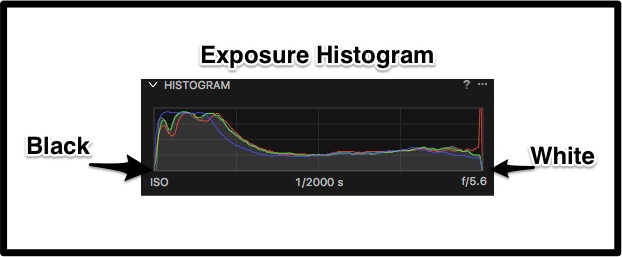
What we see here is the out of camera histogram. This is a RAW file, so there is a lot of data that gets crushed to build out a histogram with only 256 bins. The final is a 14 bit RAW so that means that the RAW data will generate 16,384 unique value bins, thus all 8 bit histograms of RAW images are compromises.
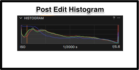
Next is the post edit histogram. You can see the changes that the editing process has made.
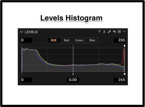
The Levels histogram looks a lot like the overall exposure histogram but it’s not exactly the same because the exposure histogram must take into account the tonal curves and so we see some differences between the Exposure and Levels histogram.
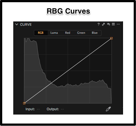
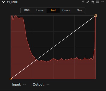
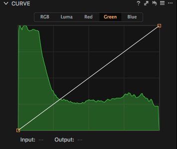
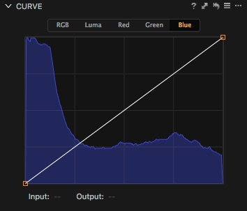
The next four histograms are Curves histograms. I’ve produced an RGB histogram as well as unique ones for each channel.
Looking at these histograms individually we can see the tonal contributions of the primary colours and then see how they combine to produce the composite RGB histogram where each colour has a one-third contribution level. We can also see where individual colours are strongest going from black to white. In this case we can see that all colours are pretty even through the midtones and the whites although the reds spike at the far right. The really strong areas are the shadows and the blacks. Someone living solely by the histogram would try to pull these all to the right, but that may not result in a good image.
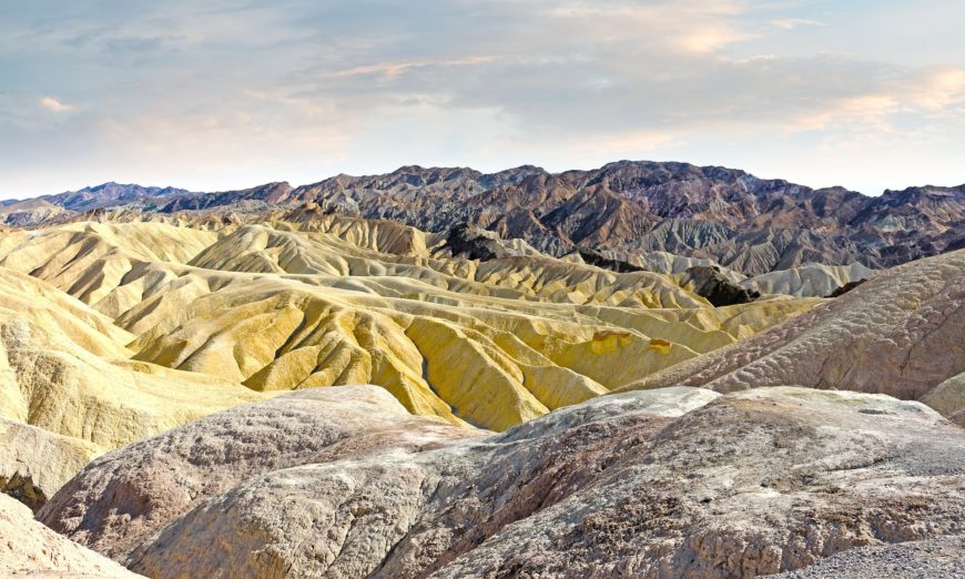
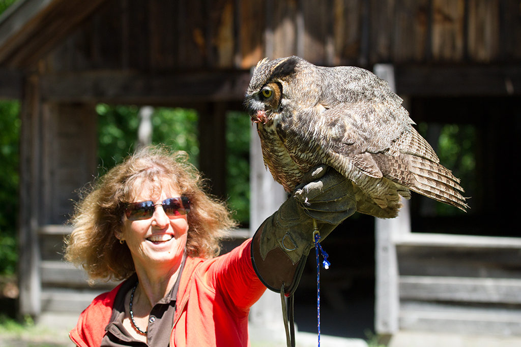
In looking solely at the histograms we are looking only at the data, not at the image and that doesn’t do much to tell us if we have been successful. So here are the before and after photos. The image was made at noon on a cloudless day, it’s about as horrible light as can be. Yet some very subtle adjustments improve the image so it is at least usable and you can really see the joy in my friend’s face when she “catches” the Great Horned Owl.
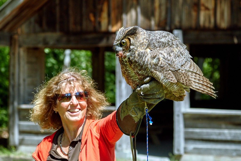
Figure 5 : Small changes using only Blacks, Whites, Shadows, Highlights and Midtones, produce a more usable image
A histogram, or multiple histograms are tools. They don’t have to be a black art, and you can learn to understand what they are telling you without enormous effort. Knowing how to use these powerful tools can help your editing experience enormously. Now just a quick note about the histogram that some cameras can show on the LCD. Remember that all images on the LCD are in camera JPEG conversions. Some cameras do a much better job than others, but in every case that tiny histogram you see is informational only. It’s a tool, but really not a very accurate one, so don’t base the viability of the image solely on what you see on the LCD. There’s going to be a lot more than you can see on that little screen, even when you are only shooting JPEGs.
Until next time, peace.


COMMENT (1)
wheresaldo
()
Hi,
Great article, thank you for sharing! I made a Photo Extension Histogram app for Apple Photos for the iPhone and iPad. I hope you like it!
Photo Extension Histogram
https://itunes.apple.com/us/app/photo-extension-histogram/id1084416191?mt=8
Aldo