We’ve been running #PhotoMonday here on the Henry’s Blog for about five months now. That’s five months that we have featured some absolutely incredible photography from YOU, our friends, family, community, lower followers, and whatever other names you would like to call yourselves. This week, we’re going to take a look back at some of the top photos from #PhotoMonday, and why they were picked.
Oh, and if you’re looking for the submission form, it’s still active on last week’s #PhotoMonday post. Mark, the curator of this awesome collection, is on vacation until November, so you’ll have even more time to submit your photos to be featured in November.
June 3, 2013
Alien Dandelion by Bryan McGowan
I’m a huge fan of macro photography, and while I don’t do much of it myself, I decided that the first edition of Photo Monday would have a theme – Macro. There were a lot of great submissions, and then there was this one, by Bryan McGowan. At first, I did not quite know what to make of it (though the title did give it away somewhat). There’s an incredible level of detail and sharpness in this image that I absolutely adore. Not only that, but it requires a great amount of patience to pull off something like this – taken outside in the natural surroundings, you’re dealing with wind, light, and other factors. Taken inside under artificial circumstances, it can be hard to make something like this look natural without making it too forced. Overall, I think this is a great image, and worthy of the first Photo Monday feature.
June 10, 2013
Photos like this are always impressive. It takes a great amount of patience and timing to pull off something like this – trust me, I tried. When you get it right however, the results are astounding, and the sense of accomplishment is like no other. The best part about it is that you can always do something different. Vary the timing of the shutter by just a fraction of a second, and you’ll catch the water droplets in an entirely different state. For the skill alone, I am glad that Robert Alemany submitted this photo for Photo Monday, and I’m glad to have the opportunity to share it again with all of you.
June 17, 2013
Toronto, the city I call home… For me, this image stood out among all others because it is different from all others. Many of the images of the Toronto skyline that you’ll see these days are pretty formulaic. A lot of them are taken from the same spots during a lot of the same conditions and times of day. This one however, includes a foreground element that adds a bit of a more dynamic feel to the image. With a slightly longer exposure to create smooth water in Lake Ontario, Lena Dawood captured an image of the Toronto skyline that likely will never be the same again. The tide will change, the log will move, and the next time someone attempts this image, they’ll have to find some other interesting element to include in the picture.
June 24, 2013
As I said before, I’m a huge fan of macro photography, but I’m also a huge fan of the bright, vivid colours in nature. In this image, Amarpreet Kaur does an excellent job of capturing the fine details in this flower’s centre, and because of the unique depth of field associated with this image, is also able to have the edges of the flower in focus as well. While subtle, these slight differences in focus really go a long way to help create a better looking image.
July 1, 2013
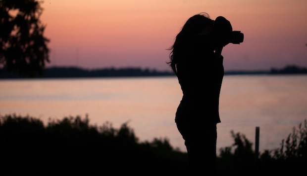
Wendy, capturing a moment by Gary Holgate
There’s something about silhouettes that always draws me in. I’m not sure whether its the desire to see more detail – and not being able to – or the “blank slate” nature of them that lets me imagine my own details. Either way, Gary Holgate did a great job with this capture.
July 8, 2013
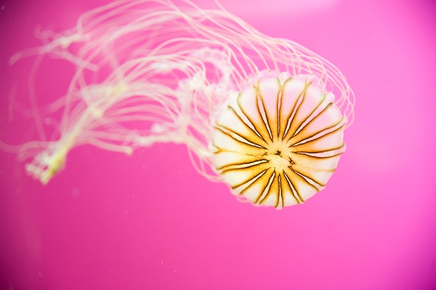
Purple-Striped Jellyfish by Melanie Geroche
Have you ever just sat and stared at a jellyfish tank? I mean, really sat and stared? You can do it for hours upon hours, and it never gets old. Majestic and beautiful, I’m always a sucker for well done photos of jellyfish, so this image by Melanie Geroche is a no-brainer for me as a selection for the image of the week. What really makes this image work for me is the shallow depth of field that keeps the bell of the jellyfish in focus while the long tentacles flowing out the back are gracefully unfocussed.
July 15, 2013
I can’t imagine that patience that is necessary to capture awesome images of insects such as this. All I know is that I certainly wouldn’t have the patience for it, which is a shame really, because I’m missing out on some great photo opportunities like this one. Daniel did a great job of capturing this dragonfly resting for a moment – and in an odd pose no less. Just the skill and patience involved with locking on, focussing, and snapping the photo made this photo worthy of a feature.
July 22, 2013
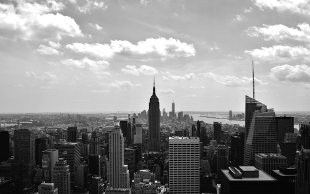
Ah, Manhattan, the city that never sleeps. I’ve been twice before, and both times I enjoyed every moment. Seeing this image from Alia Syed doesn’t remind me of my trips though – it reminds me of the early and historic photographs of the city. At least, that’s the feel that this image gives me. It’s a spectacular view when you make it to the top of one of Manhattan’s many skyscrapers, and I always appreciate when people are able to accurately capture that feeling in a photo.
July 29, 2013
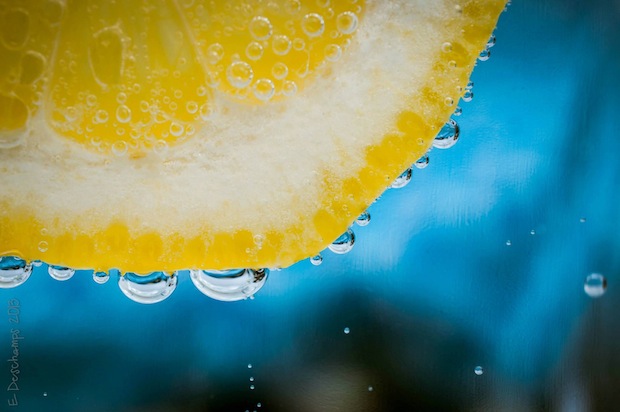
Just look at this image. It’s cool. It’s very cool. Again, macro photos really do it for me, but I think what stands out more for me in this photo is that it places complimentary colours against each other. In the RGB (for displays) and CMYK (for printing) colour wheels, yellow and blue are typically across from each other, and so compliment each other very well. The air bubbles caught on the lemon slice also make for a great element in this image, giving a slight glimpse of the world outside the frame of the image. All told, this image works very well.
August 5, 2013
504 Broadview Stn by Ash Furrow
Again, I’m a sucker for things that have to do with Toronto, so a TTC streetcar image at some point had to make it into the Photo Monday feature pool. Ash Furrow did a great job of selectively discolouring this image to emphasize the whole “red rocket” feel of the TTC. While selective colour is in my opinion an old and overdone technique (particularly among wedding photographers), it is done in such a way here that it seems as though the image was actually shot that way.
Check out Part 2 here!


