*Please note you’ll need some basic knowledge of Photoshop to follow along, as the following technique requires you to be familiar with layers and opening files in your Photoshop Document.
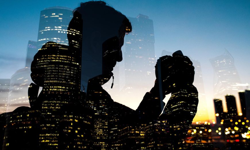
Double exposure shots have been popular in both the photography and graphic design space. It’s a relatively simple technique that offers amazing results if you just spend a little time honing your skills to get it just right.
In the past, when working with film, a double exposed effect could be created by exposing one image, then capturing and exposing an additional image without advancing the frame. Double exposures created a new way of framing, intersecting and composing an image, while adding a personal touch. Multiple software options such as Photoshop, a cheap adobe software like Adobe Creative Cloud, etc., could be used to add this effect to pictures.
Over the years, the method of creating a double exposure has changed and become even easier to achieve with editing software like Photoshop and Indesign; if it’s been a while since you used these programmes, or you are a beginner, then you can click here to take a course and improve your skills. With the introduction of digital photography and software, such as Photoshop, you no longer need to compose, capture and expose your double exposure manually while out in the field and using film excessively.
Like everything in Photoshop, there are several different ways to produce this type of imaging effect, so if you have another way you like to use then we would love for you to share it with us in the comments section.
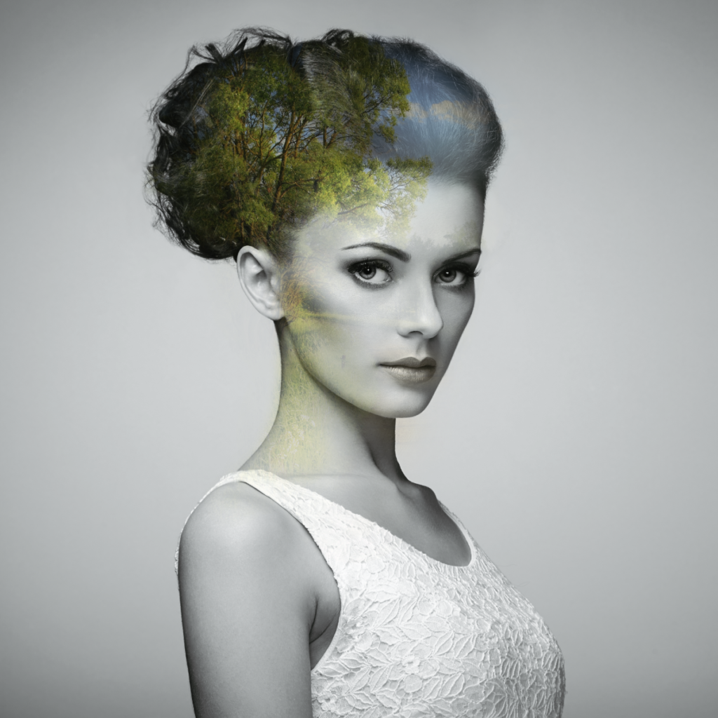
Here are the steps that I took to produce the effect image you see:
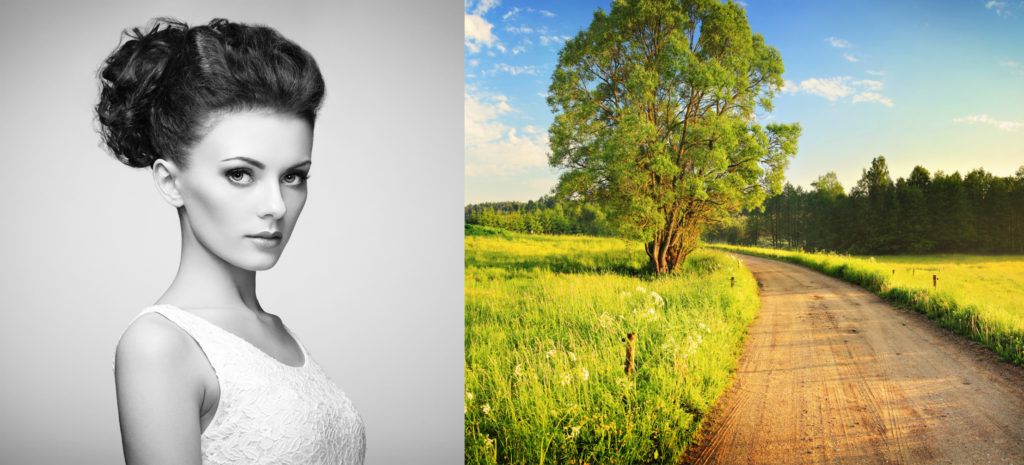
- First, and probably most important, you’ll want to choose two great images to work with. Most times this will be a portrait and either a landscape or cityscape. The stark contrast between the two types of images and textures is what makes your final product really stand out and make the effect more dynamic.
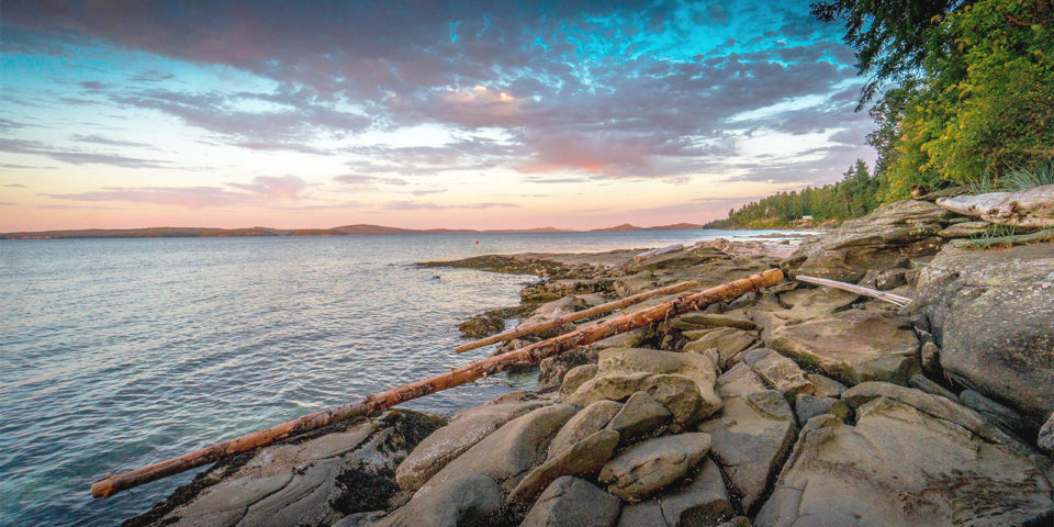
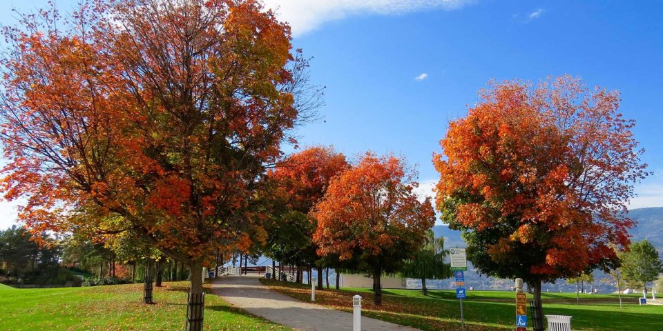
A couple of things to think about while choosing your images are contrast, colour, and shapes. In my example I chose a black and white image and a really colourful landscape. You could also choose harmonious colours like a cool portrait with lots of blues and winter landscape that also has a load of blues. On the flip side, you could choose warm colours for your portrait and contrast them with cool colours in your landscape or even merge together grayscale images. That’s what makes these types of projects so great. The creative freedom and options are limitless.
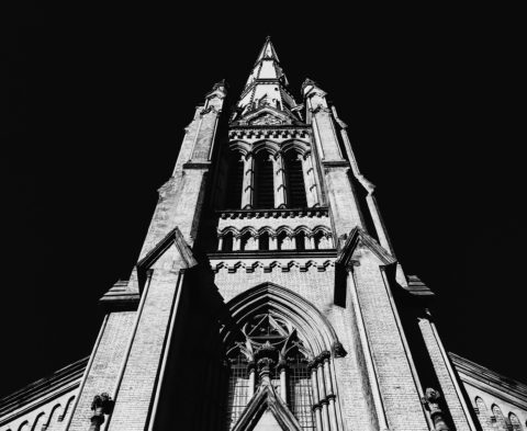
Shapes are important in how they complement one another in the image. For instance, in my example I liked the way that the composition of the trees in the landscape photograph would work well together with the textures in the model’s hair. You could also choose to use more contrasting shapes like a cityscape, which would again produce another exciting but completely different effect.
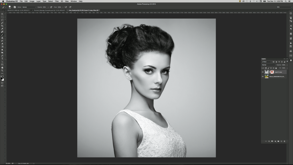
- Next, you’ll need to load both of your items into the same Photoshop document and place each photo onto different layers. Your portrait should be above the landscape layer as shown in the screenshot below. If done correctly, the only thing that you should see in your document canvas at the moment is your portrait image.
- Next you’ll want to create a layer mask on your portrait image. If you’re not familiar with layer masks, they are one of the most important tools in Photoshop that allow you to create non-destructive Photoshop documents, meaning you never alter an image in your document in a way that permanently changes it. Stay tuned to learn more on layer masks in one of our future blog posts.
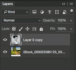
You’ll notice that that adds a new white linked beside the layer thumbnail in the layer panel. This is your layer mask.
So far you’ll see no changes at all to your image.
- Next we are going to paint out sections of your portrait to let sections of the layer below show through. This is very similar to erasing parts of the image, except by doing that you don’t have the option to bring it back whenever you want (destructive photo editing).
To start removing parts of your portrait, you’ll need to first select the layer mask by clicking on it in the layers panel. When it’s selected it should have a box around it to indicate it is active.
*It’s extremely important to have your mask selected and not the image itself or else you will be painting upon the image itself.
With your layer mask selected, choose the paintbrush tool from your tool palette.
You’ll notice that the colour boxes in the tools palette default back to black and white, even if you had a colour selected. This is because you can only paint your mask with black or white. Black to remove and white to add back in.
- Start painting some black onto your image. Instead of black showing you’ll notice that you’ll start seeing pieces of your landscape show though. MAGIC! Okay, not really. What is happening is that when you paint black onto your layer mask it allows the image below to show though. So if your brush opacity is at 100% you’ll see 100% of the layer below where you paint. Go ahead and try it. If you don’t like the result, you can choose white and paint that section back in. If you’re doing this right you’ll also notice your layer mask start to have greys and black in it.
You’ll notice that the most successful double exposures look blended together and not just like one image or the other. To achieve this you’ll need to set your brush opacity lower. I like to use 15-25%. That allows you to paint in small amounts of the image below so that it blends more with the texture in your portrait.
That’s pretty much it! You can play around with different effects from the brushes, and adding and subtracting from different areas of the photo until you achieve an end result you like.
In my example I let the organic nature of the trees work with the shapes and waves of the model’s hair. I also let some subtle grassy textures show through on her skin, giving her a slightly alien and otherworldly vibe.
So get started, play around, try different techniques and images and just have fun with it!
