As one progresses in the creative arts, a question will arise pondering how to go from good to great. One giant step in the process is to learn the basics of colour theory, and the emotional context of colour.
The Colour Wheel
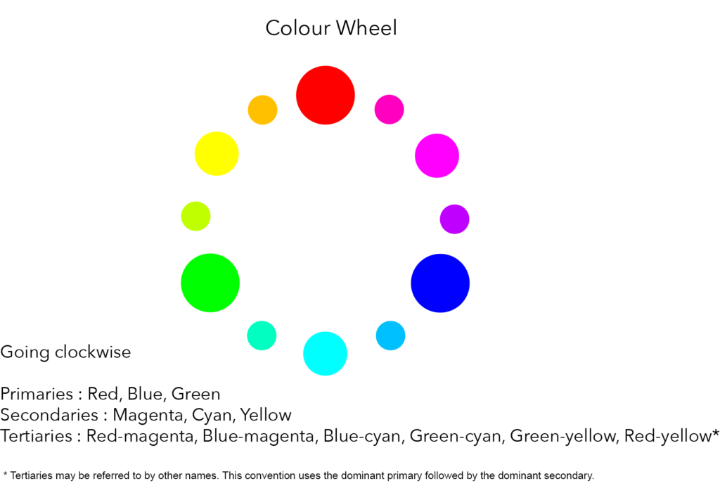
For those of us who went to art class in school, we might remember the idea of primary and secondary colours. Light has the same idea, but the colours are different. The primary colours in light (from a human perspective anyway) are red, green and blue, from where we get the whole idea of RGB. A luminance value of zero for each gives us black and a luminance value of 255 for each gives us white. Since we measure colour most commonly in eight bits, this is where the idea of 16M different colours are available.
Since red, green and blue make up a triad, one of the first ways to make an image interesting is to look for dominant colour pairs. At Christmas time, we see a strong emphasis on red and green together, because this colour pair is effective. We see red and blue used a lot in flags and we see blue and green used together in clothing. This is called using primary adjacent pairs and definitely works.
The secondary colours are those created by mixing adjacent pairs. Red and blue together create magenta. Blue and green together create cyan, and red and green together create yellow. Thus, our secondary colours in light are cyan, magenta and yellow. This may sound like printing inks, but keep the two separate because light is transmissive and inks are reflective. Not the same at all.
What is useful to see is where the secondary colours appear on the colour wheel. Yellow is opposite blue. Cyan is opposite red. Magenta is opposite green. For the most dynamic colour juxtaposition, use the primary and the secondary colours that are opposite each other. This is a very common tactic used in comic book character costumes. The colours are referred to as the natural complements.
Another approach to colour is to use three adjacent colours together, but doing so effectively requires the addition of the tertiary colours to the wheel. The labelling for these colours is less refined, but you can see in the graphic what is meant by tertiary, or third colour set. This methodology is often used by decorators to bring a design together with similar yet different colours. We call this the use of analogous colour.
Adding Emotion
We can then add some emotion to the palette by introducing white and black. By reducing the luminosity, we add black, referred to correctly as adding shading. By increasing the luminosity, we add white, referred to correctly as adding tint. The mixing of the colours along with shade and tint, is what gives us our complete colour palette of 16,777,216 colours in an 8-bit colour model.
Psychological Associations
Colour also has some psychological associations that arise through culture and environment. I’ve put together a table for you that lists the common positive and negative psychological associations of colour. Interestingly, many people only see one side of the table, and learning both is enlightening.
| Colour | Positive Aspect | Negative Aspect |
| Red | Power, strength, warmth | Offensive, anxiety, pain |
| Green | Unity, peace, refreshment | Stagnancy, blandness, disgust |
| Blue | Cool, logical, efficient | Cold, detached, stoic |
| Yellow | Optimism, creativity | Fear, fragility |
| Magenta | Truth, spirituality | Corruption, suppression, inferiority |
| Orange | Comfort, food, passion | Frustration, adolescence |
| Pink | Tranquility, femininity (only in the last 100 years) | Inhibition, weakness |
| Grey | Stability, relief | Compromise, depression |
| White | Cleanliness, simplicity | Sterility, unfeeling |
| Black | Glamour, sophistication | Oppression, heaviness |
| Brown | Earthy, hard-working | Cheap, dull, boring |
As creatives, how we use colours will have a dramatic impact on our work. Why do we like images of magenta lilacs on deep green leaves? Why do both Superman and Spider-Man have red and blue costumes? Why is Darth Vader dressed all in black and why did Luke Skywalker start out in white (he’s now in grey)?
Making Your Own Palettes
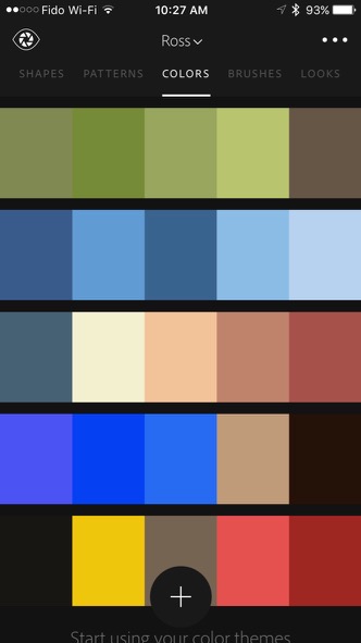
I would also encourage readers to get Adobe Capture for your smartphone or smart device. Adobe Capture is free, and will help you discover palettes that work well with your selected colour, in both the complementary and analogous modes.
I use Capture all the time to create new colour palettes for designs, decorative borders, highlight stroke lines and to select the inner mat colour in offset print mats.
Summary
Think about how you can use colour to make your images and videos more interesting. There is much more to colour theory if you choose to do some research, but this article will get you started.


